One thing I appreciate is a well designed email that presents a well defined message and is easy on the reader’s eyes. I get a plethora of emails each day, most of which I quickly scan and delete (I should probably unsubscribe from several).
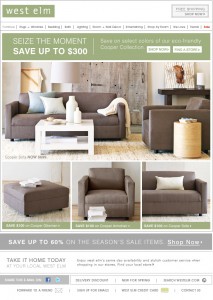
All is not doom and gloom though, because there is one that stands out from the crowd on a daily basis, and it comes from the furniture company West Elm (Seen below).

It’s interesting how the psyche works when it comes to emails. I’m interested in what West Elm has to offer, and their daily emails don’t bother me.
On the other hand, a bulk of the emails that tend to get on my nerves are marketing/PR related, which is something I’m also interested in… yet many of them annoy me to no end. Maybe it’s a combination of the sales pitch and terrible design… or the fact that there always seems to be a catch with the “free” content.
The email from West Elm clearly states the message at the top, and then provides a visual, and it’s like this in almost every email. In addition, I like how they’ve included their sites navigation in the email just in case I want to jump to a particular section of their Web site.
Email campaigns are typically inexpensive in the grand scheme of things, but having a poorly designed email could cost you by having an increased unscubscribe rate.
Do any particular email campaigns stand out to you?