It can be wildly difficult to get a customer to land on your website, so when that happens your site needs to be optimize for conversions. No matter if you are looking for email sign ups, subscriptions, product purchases or anything else of that nature, the website needs to work in your favor.
What is to follow isn’t meant to pick on the business, it’s to provide constructive feedback on a real life example that I recently experienced.
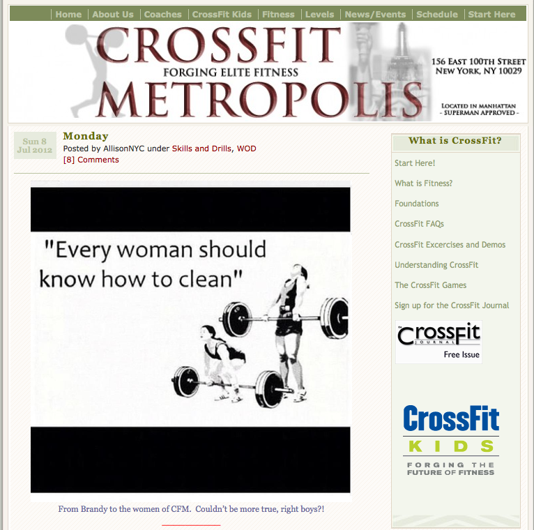
I’ve been doing CrossFit for a while now, but may need to temporarily change gyms. After a quick search on Yelp I landed on the homepage of CrossFit Metropolis (screenshot below).
 The first thing I notice was the “Every woman should know how to clean” graphic followed by their logo and eventually the CrossFit Kids graphic in the right sidebar.
Since I’m familiar with CrossFit, there are three main things I wanted out of this website: schedule, price and to sign up.
After clicking Schedule in the navigation I started looking for pricing information. I looked on the Schedule page for a bit, then went back to the homepage and after looking around for a bit I finally noticed “Start Here” in the navigation. It’s important to note that it’s right next to Schedule and that I didn’t notice it when clicking Schedule the first go round.
Upon clicking Start Here I learned that I then had to send an email to learn more about their pricing and to sign up. That’s bad.
Why is this format bad? Because I’m a consumer that’s ready to take action. Right now. After sending the email I didn’t receive any sort of automatic response sharing pricing or anything of that nature. When will they respond? Within the hour? Today? Tomorrow? This is a right now decision and by not empowering me — the consumer — to take action could be costly for CrossFit Metropolis.
Here are a few immediate suggestions I’d have to offer:
- Add a graphic to the top of the sidebar that says “Sign Up” or something along those lines. They currently have a box full of text links, one of which is Start Here, but I didn’t notice that until looking at the site for a 3rd time to prepare this recommendations. Since their site is run on WordPress this new Sign Up box would show up on every page of their website.
- Add a sing up call to action to the copy of the About page.
- Add a sing up call to action to the copy of the Schedule page.
- Get rid of the Home navigation item and replace it with Start Here.
- Make the Start Here navigation item red (or any other color) in an effort to help it standout.
These of course are high level suggestions meant to help with sign up conversions, but I’m sure additional thought would yield additional ideas that would help increase conversion (revenue) for the gym.