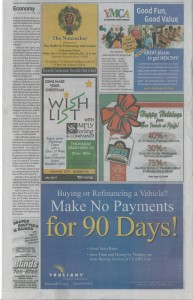
Advertising is something I handle for my day job (Truliant Federal Credit Union), and thought I’d share a recent newspaper ad with you, as well as some of the thought process behind the design.
The ad in question was for a new auto loan that allowed the first payment to be deferred for 90 days. That single fact is the highlight of the loan and what was to be the focus of the ad.
Before the design process starts I like to chat with our designer (in-house designer) to flush out ideas. During the initial conversations about this ad I pointed out that it needed to be simplistic in nature, and that the 90 day’s option needed to pop. Both points were extremely important because getting someone’s attention that’s flipping through a newspaper isn’t always the easiest thing to do.
 As the design progressed, I felt as though it was a bit busy due to a couple elements and requested they be taken out, and that ad be reformatted a bit. The end result can be seen by clicking here or enlarging the image to the left. Our ad is the blue one at the bottom of the page – take a look before you continue reading.
When I saw the layout in the paper I was happy with the route we took. The other ads are extremely cluttered and have multiple bits of info. The blue and yellow in the Truliant ad provide a nice contrast, and the “for 90 Days!” really stood out. Both goals were accomplished.
Critique
Let’s take a moment to critique one of the ads that appeared on the same page as my credit union’s ad. Take a minute and look at the page again. This time focus on the YMCA ad – and note that the publication is the Winston-Salem Journal.
Did you notice anything that stood out or something you may have done differently? My take on the YMCA ad is that, without a doubt, they should have left off the block of info that lists the contact information for various locations. They’ve included locations that are outside the readership for the Winston-Salem Journal and wasted valuable space.
Off hand, if I were taking a stab at the ad I would have highlighted one or all of the following:
- Great value (not good as highlighted in the ad)
- Family friendly
- Adding a third element might be a bit busy, but I would have considered mentioning the great classes offered at no additional costs
They did hit on the exercise classes, but went into detail… something I would not have done. One would be mistaken to assume readers are going to take the time to read the small print in an ad. The statements need to be large and easy to read – it should be assumed that someone is simply going to glance at the ad and nothing more.
If I had to guess, they probably included the various locations to hit on the convenience factor. This could have also been achieved by saying “11 locations near you,” or something of that nature, and pointed folks to their Web site for further details.
When developing newspaper ads it’s critical to remember what your focus is, and to ensure you don’t produce a cluttered ad. If you’re having trouble figuring out what the content should include, give it the good old “who cares” test.
.:Follow me on Twitter – @RyanShell:.